And Use Your Judgment to Make the Plots Look Continuous
Refine your plots
So far we have mostly used ggplot's default output when making our plots, generally not looking at opportunities to tweak or customize things to a any great extent. In general, when making figures during exploratory data analysis, the default settings in ggplot should be pretty good to work with. It's only when we have some specific plot in mind that the question of polishing the results comes up. Refining a plot can mean several things. We might want to get the look of it just right, based on our own tastes and our sense of what needs to be highlighted. We might want to format it in a way that will meet the expectations of a journal, or of a conference audience, or the general public. We might want to tweak this or that feature of the plot or add an annotation or additional detail not covered by the default output. Or we might want to completely change the look of the entire thing, given that all of the structural elements of the plot are in place. We have the resources in ggplot to do all of these things.
Let's begin by looking at a new dataset, asasec. This is some data on membership over time in special-interest sections of the American Sociological Association.
head(asasec) ## Section Sname ## 1 Aging and the Life Course (018) Aging ## 2 Alcohol, Drugs and Tobacco (030) Alcohol/Drugs ## 3 Altruism and Social Solidarity (047) Altruism ## 4 Animals and Society (042) Animals ## 5 Asia/Asian America (024) Asia ## 6 Body and Embodiment (048) Body ## Beginning Revenues Expenses Ending Journal Year Members ## 1 12752 12104 12007 12849 No 2005 598 ## 2 11933 1144 400 12677 No 2005 301 ## 3 1139 1862 1875 1126 No 2005 NA ## 4 473 820 1116 177 No 2005 209 ## 5 9056 2116 1710 9462 No 2005 365 ## 6 3408 1618 1920 3106 No 2005 NA In this dataset, we have membership data for each section over a ten year period, but the data on section reserves and income (the Beginning and Revenues variables) is for the 2015 year only. Let's look at the relationship between section membership and section revenues for a single year, 2014.
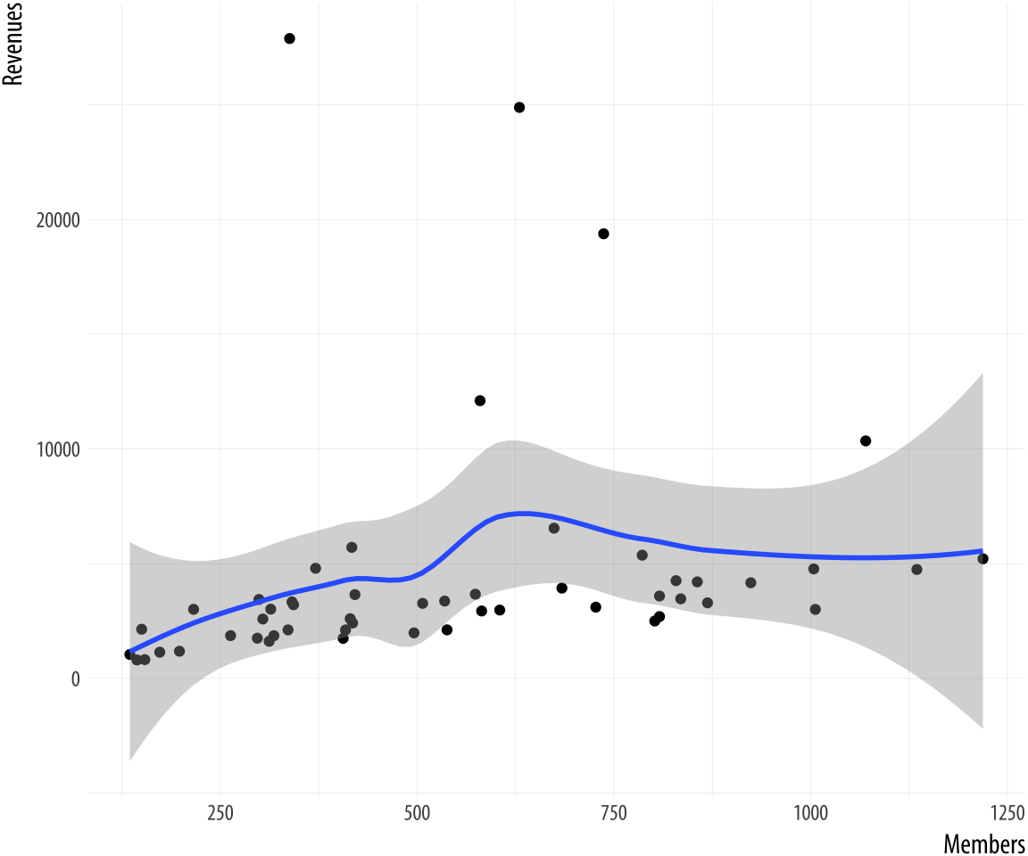 Figure 8.1: Back to Basics.
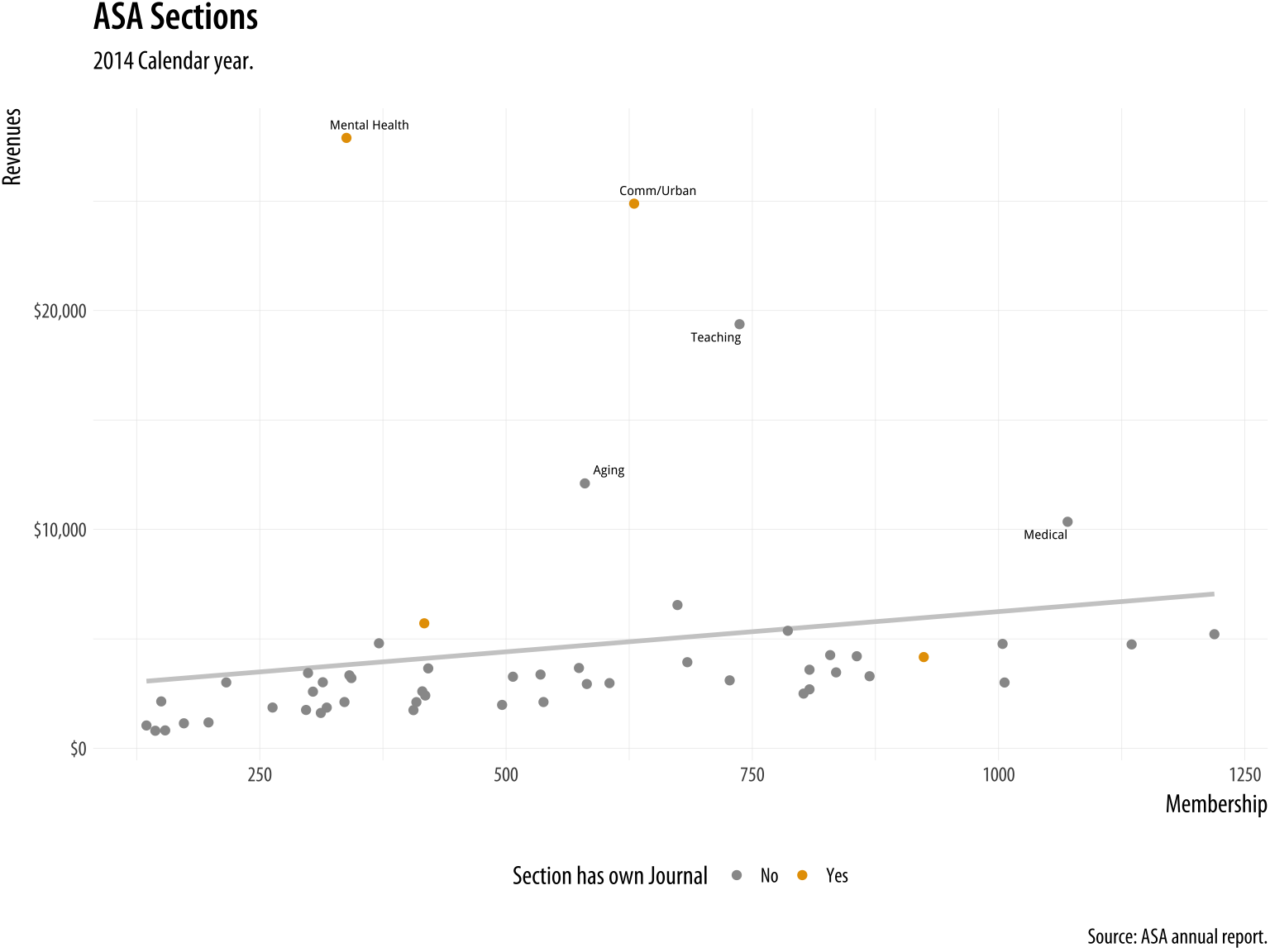
p <- ggplot(data = subset(asasec, Year == 2014), mapping = aes(x = Members, y = Revenues, label = Sname)) p + geom_point() + geom_smooth() ## `geom_smooth()` using method = 'loess' and formula 'y ~ x' This is our basic scatterplot-and-smoother graph. To refine it, let's begin by identifying some outliers, switch from loess to OLS, and introduce a third variable.
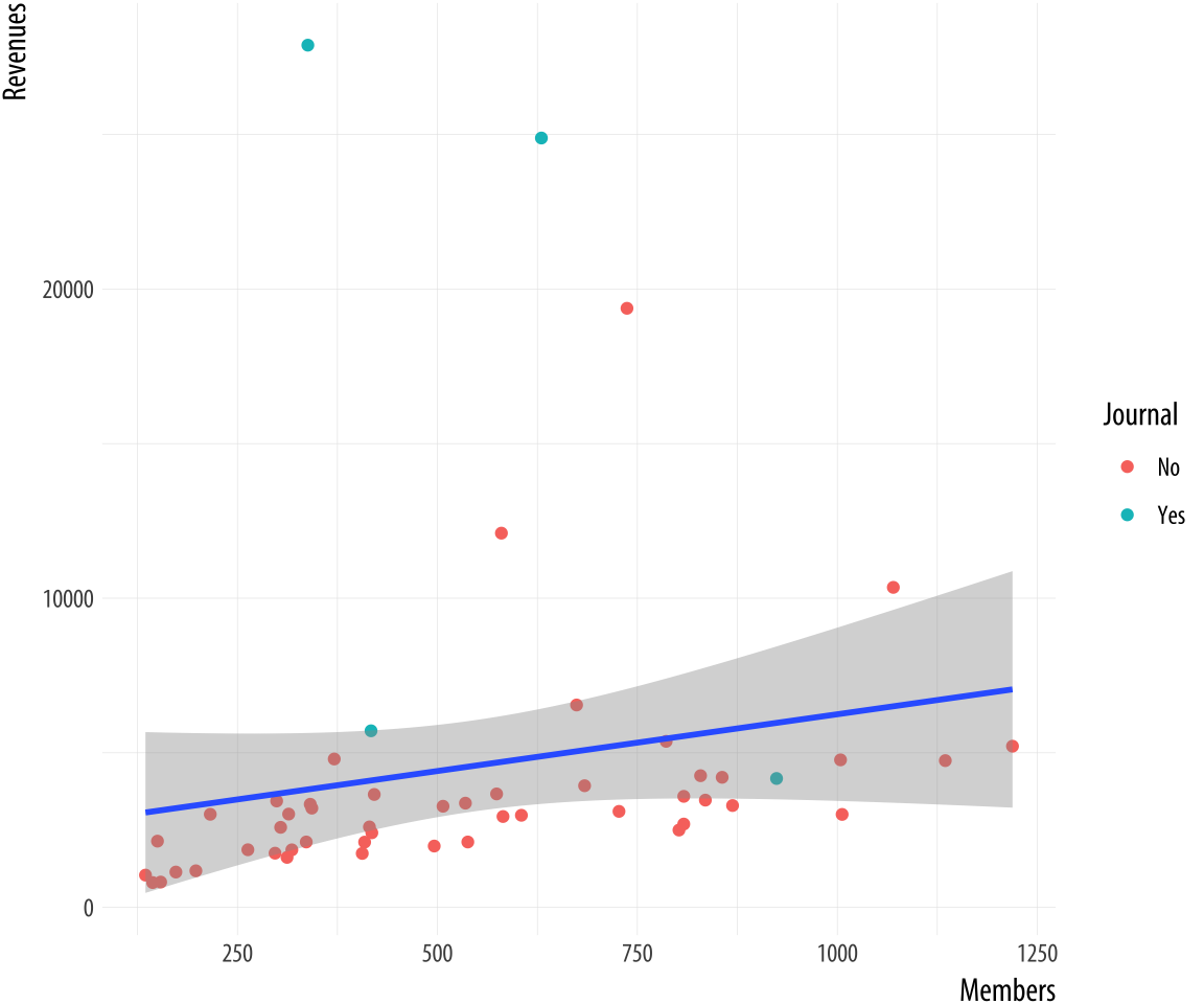 Figure 8.2: Refining the plot.
p <- ggplot(data = subset(asasec, Year == 2014), mapping = aes(x = Members, y = Revenues, label = Sname)) p + geom_point(mapping = aes(color = Journal)) + geom_smooth(method = "lm") Now we can add some text labels. At this point it makes sense to use some intermediate objects to build things up as we go. We won't show them all. But by now you should be able to see in your mind's eye what an object like p1 or p2 will look like. And of course you should type out the code and check if you are right as you go.
p0 <- ggplot(data = subset(asasec, Year == 2014), mapping = aes(x = Members, y = Revenues, label = Sname)) p1 <- p0 + geom_smooth(method = "lm", se = FALSE, color = "gray80") + geom_point(mapping = aes(color = Journal)) p2 <- p1 + geom_text_repel(data= subset(asasec, Year == 2014 & Revenues > 7000), size = 2) Continuing with the p2 object still, we can label the axes and scales. We also add a title and move the legend to make better use of the space in the plot.
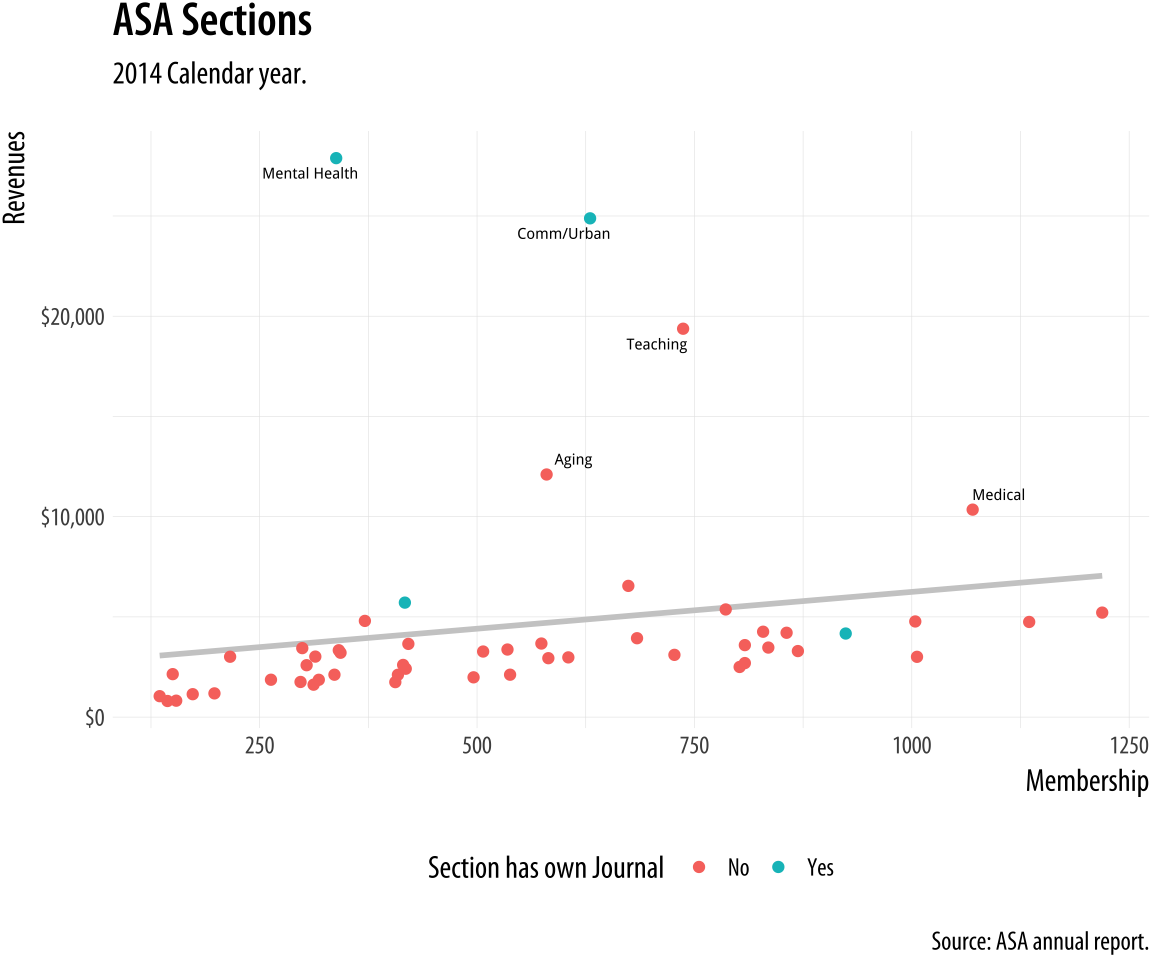 Figure 8.3: Refining the axes.
p3 <- p2 + labs(x= "Membership", y= "Revenues", color = "Section has own Journal", title = "ASA Sections", subtitle = "2014 Calendar year.", caption = "Source: ASA annual report.") p4 <- p3 + scale_y_continuous(labels = scales::dollar) + theme(legend.position = "bottom") p4 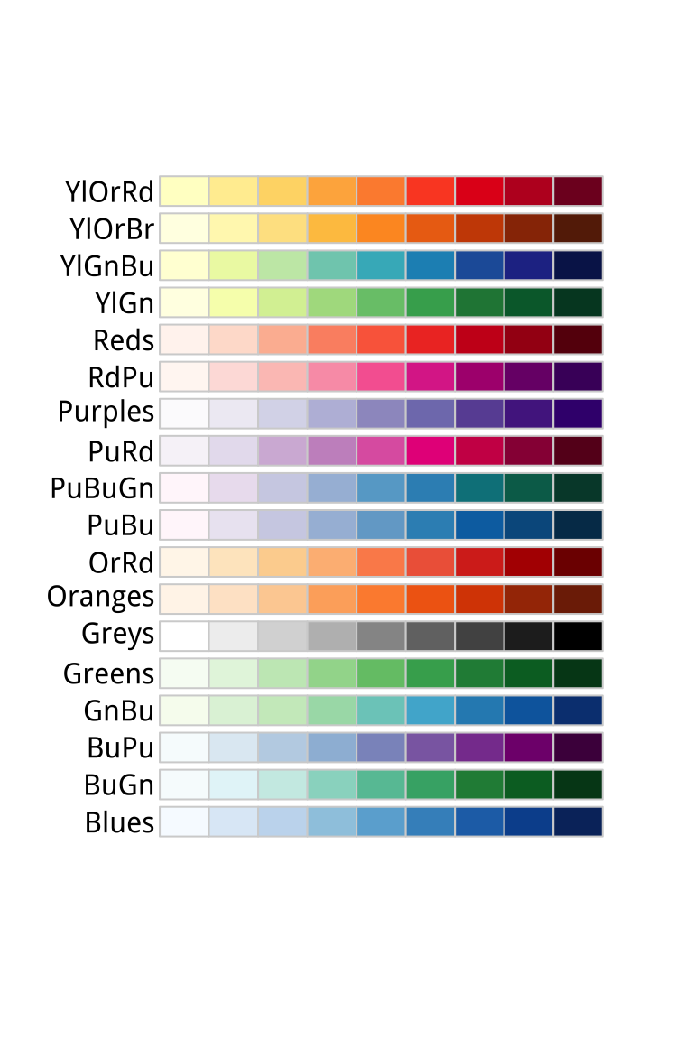 Figure 8.4: RColorBrewer's sequential palettes.
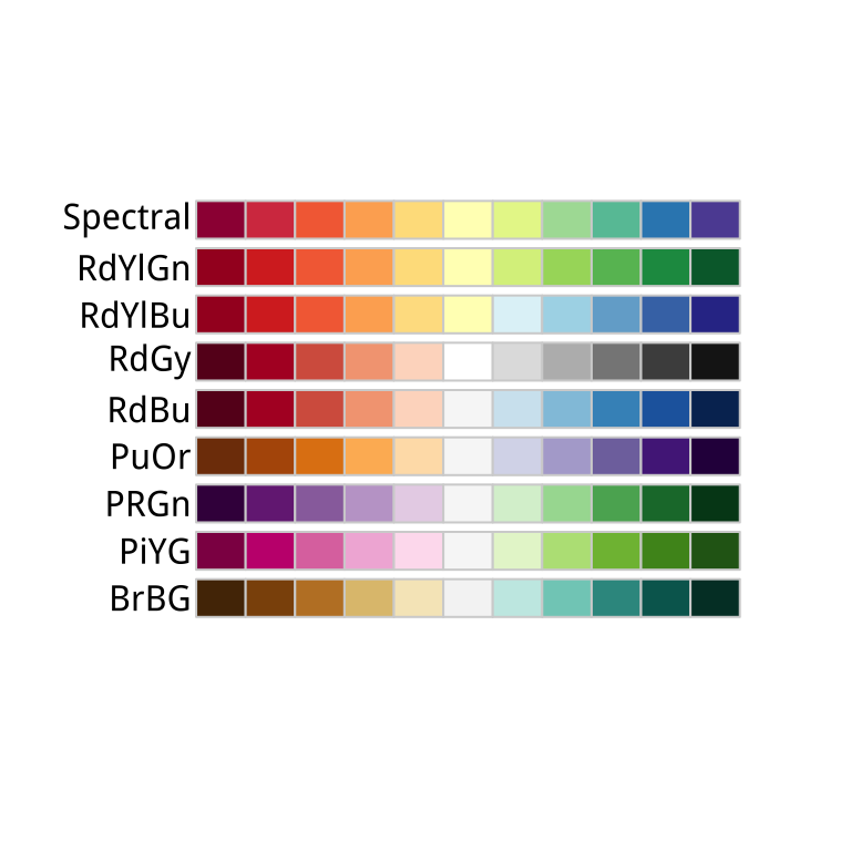 Figure 8.5: RColorBrewer's diverging palettes.
Use color to your advantage
You should choose a color palette in the first place based on its ability to express the data you are plotting. An unordered categorical variable like "Country" or "Sex", for example, requires distinct colors that won't be easily confused with one another. An ordered categorical variable like "Level of Education", on the other hand, requires a graded color scheme of some kind running from less to more or earlier to later. There are other considerations, too. For example, if your variable is ordered, is your scale centered on a neutral midpoint with departures to extremes in each direction, as in a Likert scale? Again, these questions are about ensuring accuracy and fidelity when mapping a variable to a color scale. Take care to choose a palette that reflects the structure of your data. For example, do not map sequential scales to categorical palettes, or use a diverging palette for a variable with no well-defined midpoint.
Separate from these mapping issues, there are considerations about which colors in particular to choose. In general, the default color palettes that ggplot makes available are well-chosen for their perceptual properties and aesthetic qualities. We can also use color and color layers as device for emphasis, to highlight particular data points or parts of the plot, perhaps in conjunction with other features.
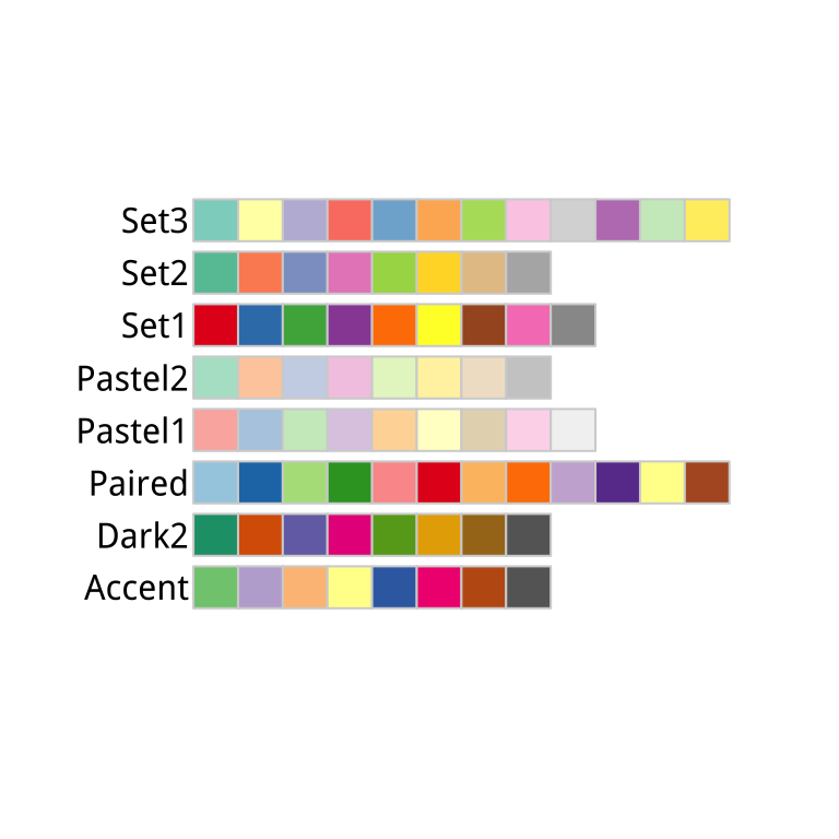 Figure 8.6: RColorBrewer's qualitative palettes.
We choose color palettes for mappings through one of the scale_ functions for color or fill. While it is possible to very finely control the look of your color schemes by varying the hue, chroma, and luminance of each color you use via scale_color_hue(), or scale_fill_hue(), in general this is not recommended. Instead you should use the RColorBrewer package to make a wide range of named color palettes available to you, and choose from those. When used in conjunction with ggplot, you access these colors by specifying the scale_color_brewer() or scale_fill_brewer() functions, depending on the aesthetic you are mapping. Figure 8.7 shows the named palettes you can use in this way.
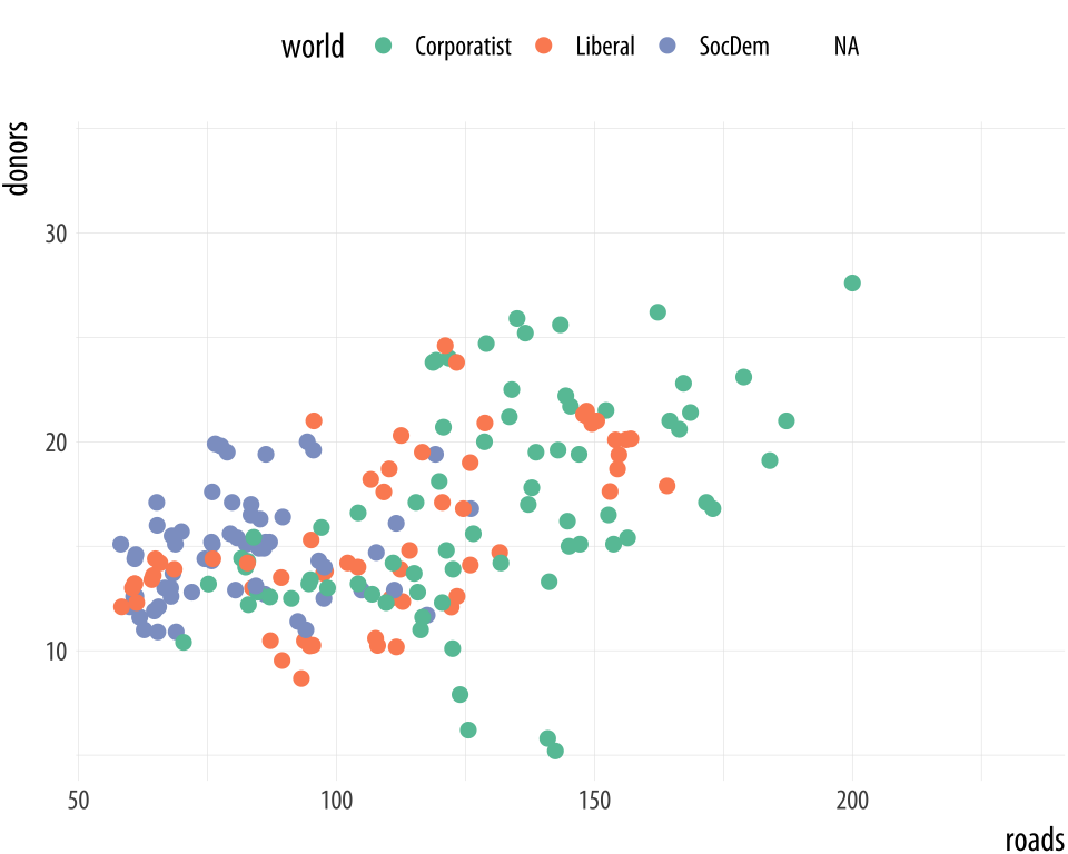
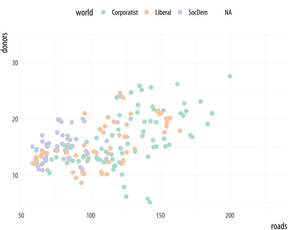
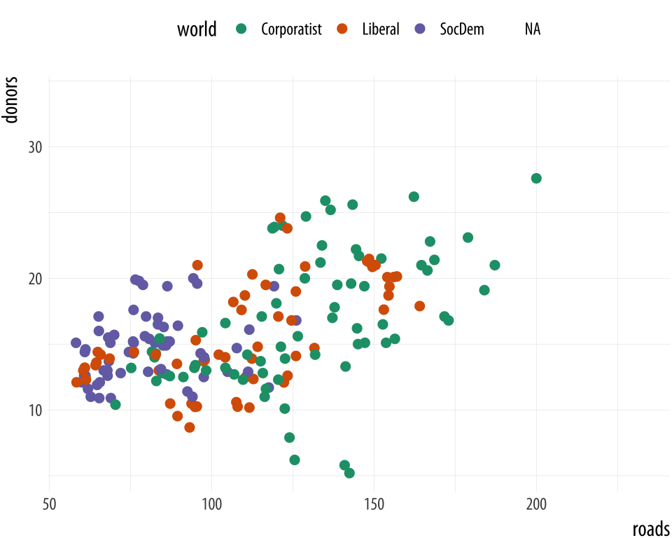 Figure 8.7: Some available palettes in use.
p <- ggplot(data = organdata, mapping = aes(x = roads, y = donors, color = world)) p + geom_point(size = 2) + scale_color_brewer(palette = "Set2") + theme(legend.position = "top") p + geom_point(size = 2) + scale_color_brewer(palette = "Pastel2") + theme(legend.position = "top") p + geom_point(size = 2) + scale_color_brewer(palette = "Dark2") + theme(legend.position = "top") You can also specify colors manually, via scale_color_manual() or scale_fill_manual(). These functions take a value argument that can be specified as vector of color names or color values that R knows about. R knows many color names (like red, and green, and cornflowerblue. Try demo('colors') for an overview. Alternatively, color values can be specified via their hexadecimal RGB value. This is a way of encoding color values in the RGB colorspace, where each channel can take a value from 0 to 255 like this. A color hex value begins with a hash or pound character, #, followed by three pairs of hexadecimal or "hex" numbers. Hex values are in Base 16, with the first six letters of the alphabet standing for the numbers 10 to 15. This allows a two-character hex number to range from 0 to 255. You read them as #rrggbb, where rr is the two-digit hex code for the red channel, gg for the green channel, and bb for the blue channel. So #CC55DD translates in decimal to CC = 204 (red), 55 = 85 (green), and DD = 221 (blue). It gives a strong pink color.
Going back to our ASA Membership plot, for example, we can manually introduce a palette from Chang (2013) that's friendly to color-blind viewers.
cb_palette <- c("#999999", "#E69F00", "#56B4E9", "#009E73", "#F0E442", "#0072B2", "#D55E00", "#CC79A7") p4 + scale_color_manual(values = cb_palette) Figure 8.8: Using a custom color palette.
As is often the case, this work has already been done for us. If we are serious about using a safe palette for color-blind viewers, we should investigate the dichromat package instead. The colorblindr package has similar functionality. It provides a range of safe palettes and some useful functions for helping you approximately see what your current palette might look like to a viewer with one of several different kinds of color blindness.
For example, let's use RColorBrewer's brewer.pal() function to get five colors from ggplot's default palette.
Default <- brewer.pal(5, "Set2") Next, we can use a function from the dichromat library to transform these colors to new values that simulate different kinds of color blindness.
library(dichromat) types <- c("deutan", "protan", "tritan") names(types) <- c("Deuteronopia", "Protanopia", "Tritanopia") color_table <- types %>% purrr:: map(~ dichromat(Default, .x)) %>% as_tibble() %>% add_column(Default, .before = TRUE) color_table ## # A tibble: 5 x 4 ## Default Deuteronopia Protanopia Tritanopia ## <chr> <chr> <chr> <chr> ## 1 #66C2A5 #AEAEA7 #BABAA5 #82BDBD ## 2 #FC8D62 #B6B661 #9E9E63 #F29494 ## 3 #8DA0CB #9C9CCB #9E9ECB #92ABAB ## 4 #E78AC3 #ACACC1 #9898C3 #DA9C9C ## 5 #A6D854 #CACA5E #D3D355 #B6C8C8 
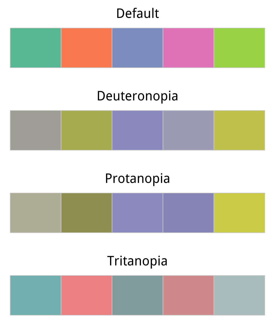 Figure 8.9: Comparing a default color palette with an approximation of how the same palette appears to people with one of three kinds of color blindness.
color_comp(color_table) In this code, we create a vector of types of color blindness that the dichromat() function knows about, and give them proper names. Then we make a table of colors for each type using the purrr library's map() function. The rest of the pipeline converts the results from a list to a tibble and adds the original colors as the first column in the table. We can now plot them to see how they compare, using a convenience function from the socviz library.
The ability to manually specify colors can be useful when the meaning of a category itself has a strong color association. Political parties, for example, tend to have official or quasi-official party colors that people associate with them. In such cases it is helpful to be able to present results for, say, the Green Party in a (perceptually balanced!) green color. When doing this, it is worth keeping in mind that some colors are associated with categories (especially categories of person) for outmoded reasons, or no very good reason. Do not use stereotypical colors just because you can.
Layer color and text together
Aside from mapping variables directly, color is also very useful when we want to pick out or highlight some aspect of our data. In cases like this that the layered approach of ggplot can really work to our advantage. Let's work through an example where we use manually specified colors both for emphasis and because of their social meaning.
We will build up a plot of data about the 2016 US general election. It is contained in the county_data object in the socviz library. We begin by defining a blue and red color for the Democrats and Republicans. Then we create the basic setup and first layer of the plot. We subset the data, including only counties with a value of "No" on the flipped variable. We set the color of geom_point() to be a light gray, as it will form the background layer of the plot. And we apply a log transformation to the x-axis scale.
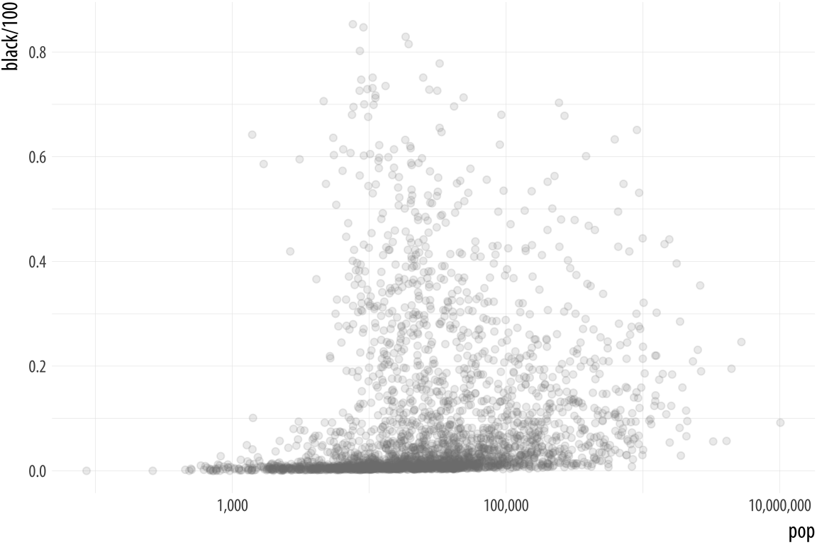 Figure 8.10: The background layer.
# Democrat Blue and Republican Red party_colors <- c("#2E74C0", "#CB454A") p0 <- ggplot(data = subset(county_data, flipped == "No"), mapping = aes(x = pop, y = black/ 100)) p1 <- p0 + geom_point(alpha = 0.15, color = "gray50") + scale_x_log10(labels=scales::comma) p1 In the next step we add a second geom_point() layer. Here we start with the same dataset but extract a complementary subset from it. This time we choose the "Yes" counties on the flipped variable. The x and y mappings are the same, but we add a color scale for these points, mapping the partywinner16 variable to the color aesthetic. Then we specify a manual color scale with scale_color_manual(), where the values are the blue and red party_colors we defined above.
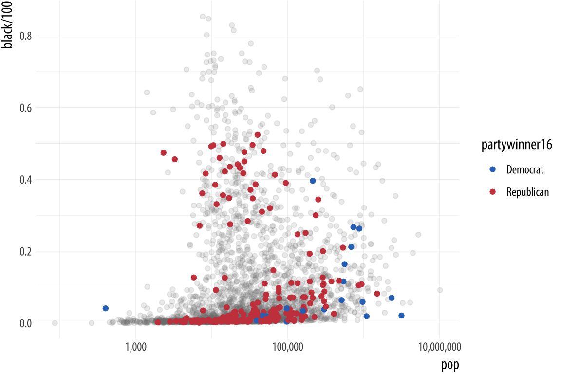 Figure 8.11: The second layer.
p2 <- p1 + geom_point(data = subset(county_data, flipped == "Yes"), mapping = aes(x = pop, y = black/ 100, color = partywinner16)) + scale_color_manual(values = party_colors) p2 The next layer sets the y-axis scale and the labels.
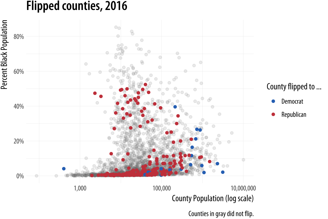 Figure 8.12: Adding guides and labels, and fixing the x-axis scale.
p3 <- p2 + scale_y_continuous(labels=scales::percent) + labs(color = "County flipped to ... ", x = "County Population (log scale)", y = "Percent Black Population", title = "Flipped counties, 2016", caption = "Counties in gray did not flip.") p3 Finally, we add a third layer using the geom_text_repel() function. Once again we supply a set of instructions to subset the data for this text layer. We are interested in the flipped counties that have with a relatively high percentage of African-American residents. The result, shown in Figure 8.13 is a complex but legible multi-layer plot with judicious use of color for variable coding and context.
p4 <- p3 + geom_text_repel(data = subset(county_data, flipped == "Yes" & black > 25), mapping = aes(x = pop, y = black/ 100, label = state), size = 2) p4 + theme_minimal() + theme(legend.position= "top") When producing a graphic like this in ggplot, or when looking at good plots made by others, it should gradually become your habit to see not just the content of the plot but also the implicit or explicit structure that it has. First, you will be able to see the mappings that form the basis of the plot, picking out which variables are mapped to x and y, and which to to color, fill, shape, label, and so on. What geoms were used to produce them? Second, how have the scales been adjusted? Are the axes transformed? Are the fill and color legends combined? And third, especially as you practice making plots of your own, you will find yourself picking out the **layered* structure of the plot. What is the base layer? What has been drawn on top of it, and in what order? Which upper layers are formed from subsets of the data? Which are new datasets? Are there annotations? The ability to evaluate plots in this way, to apply the grammar of graphics in practice, is useful both for looking at plots and for thinking about how to make them.
Change the appearance of plots with themes
Our elections plot is in a pretty finished state. But if we want to change the overall look of it all at once, we can do that using ggplot's theme engine. Themes can be turned on or off using the theme_set() function. It takes the name of a theme (which will itself be a function) as an argument. Try the following:
theme_set(theme_bw()) p4 + theme(legend.position= "top") theme_set(theme_dark()) p4 + theme(legend.position= "top") Internally, theme functions are a set of detailed instructions to turn on, turn off, or modify a large number of graphical elements on the plot. Once set, a theme applies to all subsequent plots and it remains active until it is replaced by a different theme. This be done either through the use of another theme_set() statement, or on a per-plot basis by adding the theme function to the end of the plot: p4 + theme_gray() would temporarily override the generally active theme for the p4 object only. You can still use the theme() function to fine-tune any aspect of your plot, as seen above with the relocation of the legend to the top of the graph.
The ggplot library comes with several built-in themes, including theme_minimal() and theme_classic(), with theme_gray() or theme_grey() as the default. If these are not to your taste, install the ggthemes library for many more options. You can, for example, make ggplot output look like it has been featured in the Economist, or the Wall Street Journal, or in the pages of a book by Edward Tufte.
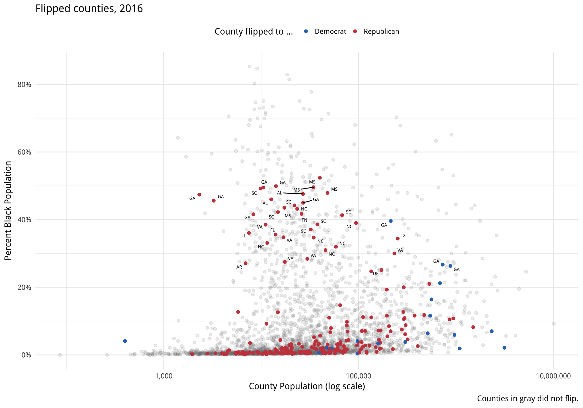
Figure 8.13: County-level election data from 2016.
Using some themes might involve adjusting font sizes or other elements as needed, if the defaults are too large or small. If you use a theme with a colored background, you will also need to consider what color palette you are using when mapping to color or fill aesthetics. You can define your own themes either entirely from scratch, or by starting with one you like and making adjustments from there.
library(ggthemes) theme_set(theme_economist()) p4 + theme(legend.position= "top") theme_set(theme_wsj()) p4 + theme(plot.title = element_text(size = rel(0.6)), legend.title = element_text(size = rel(0.35)), plot.caption = element_text(size = rel(0.35)), legend.position = "top") 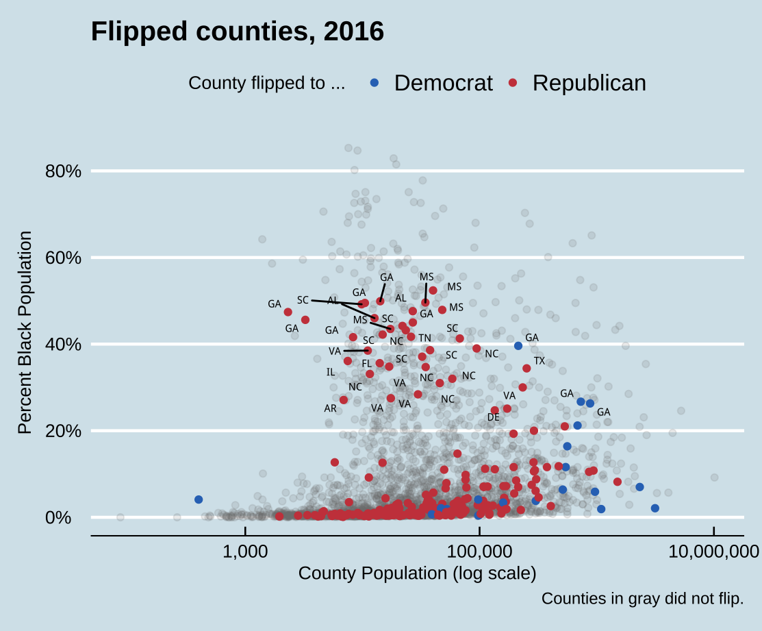
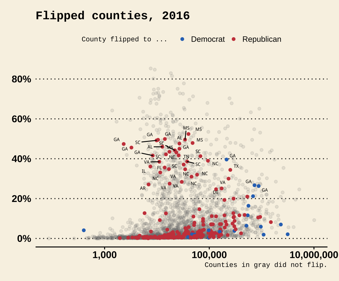
Figure 8.14: Economist and WSJ themes.
Generally speaking, themes with colored backgrounds customized typefaces are best used when making one-off graphics or posters, when preparing figures to integrate into a slide presentation, or when conforming to a house or editorial style for publication. Take care to consider how the choices you make will harmonize with the broader printed or displayed material. Just as with the choice of palettes for aesthetic mappings, when starting out it can be wisest to stick to the defaults or consistently use a theme that has had its kinks already ironed out. Claus It also contains some convenience functions for laying out several plot objects in a single figure, amongst other features, as we shall see below in one of the case studies. O. Wilke's cowplot package, for instance, contains a well-developed theme suitable for figures whose final destination is a journal article. Bob Rudis's hrbrthemes package, meanwhile, has a distinctive and compact look and feel that takes advantage of some freely-available typefaces. Both are available via install.packages().
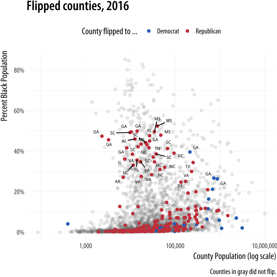
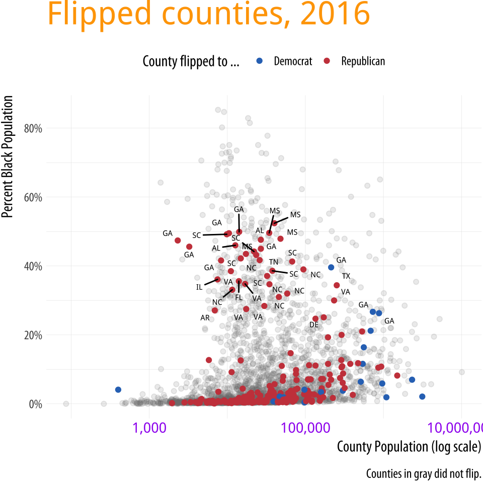
The theme() function allows you to exert very fine-grained control over the appearance of all kinds of text and graphical elements in a plot. For example, we can change the color, typeface, and font weight of text. If you have been following along writing your code, you will have noticed that the plots you make have not been identical to the ones shown in the text. The axis labels are in a slightly different place from the default, the typeface is different, and there are other smaller changes as well. The theme_book() function provides the custom ggplot theme used throughout this book. The code for this theme is based substantially on Bob Rudis's theme_ipsum(), from his hrbrthemes library. You can learn more about it in the Appendix. For this one figure, we then adjust that theme even further by tweaking the text size, and we also remove a number of elements by naming them and making them disappear using element_blank().
p4 + theme(legend.position = "top") p4 + theme(legend.position = "top", plot.title = element_text(size= rel(2), lineheight=.5, family= "Times", face= "bold.italic", colour= "orange"), axis.text.x = element_text(size= rel(1.1), family= "Courier", face= "bold", color= "purple")) Figure 8.15: Controlling various theme elements directly.
Use theme elements in a substantive way
It makes good sense use themes as a way to fix design elements, because that means you can subsequently ignore them, and focus instead on the data you are examining. But it is also worth remembering that ggplot's theme system is very flexible. It permits a wide range of design elements to be adjusted in order to create custom figures. For instance, following an example from Wehrwein (2017), we will create an effective small multiple of the age distribution of GSS respondents over the years. The gss_lon data contains information on the age of each GSS respondent for all the years in the survey since 1972. The base of the figure is a scaled geom_density() layer of the sort we saw earlier, this time faceted by the year variable. We will fill the density curves with a dark grey color, and then add an indicator of the mean age in each year, and a text layer for the label. With those in place we then adjust the detail of several theme elements, mostly to remove them. As before we use element_text() to tweak the appearance of various text elements such as titles and labels. And we also use element_blank() to remove several of them altogether.
First, we need to calculate the mean age of the respondents for each year of interest. Because the GSS has been around for most (but not all) years since 1972, we will look at distributions about every four years since the beginning. We use a short pipeline to extract the average ages.
yrs <- c(seq(1972, 1988, 4), 1993, seq(1996, 2016, 4)) mean_age <- gss_lon %>% filter(age %nin% NA && year %in% yrs) %>% group_by(year) %>% summarize(xbar = round(mean(age, na.rm = TRUE), 0)) mean_age$y <- 0.3 yr_labs <- data.frame(x = 85, y = 0.8, year = yrs) The y column in mean_age will come in handy when we want to position the age as a text label. Next, we prepare the data and set up the geoms.
p <- ggplot(data = subset(gss_lon, year %in% yrs), mapping = aes(x = age)) p1 <- p + geom_density(fill = "gray20", color = FALSE, alpha = 0.9, mapping = aes(y = ..scaled..)) + geom_vline(data = subset(mean_age, year %in% yrs), aes(xintercept = xbar), color = "white", size = 0.5) + geom_text(data = subset(mean_age, year %in% yrs), aes(x = xbar, y = y, label = xbar), nudge_x = 7.5, color = "white", size = 3.5, hjust = 1) + geom_text(data = subset(yr_labs, year %in% yrs), aes(x = x, y = y, label = year)) + facet_grid(year ~ ., switch = "y")  Figure 8.16: A customized small multiple.
The initial p object subsets the data by the years we have chosen, and maps x to the age variable. The geom_density() call is the base layer, with arguments to turn off its default line color, set the fill to a shade of gray, and scale the y-axis between zero and one.
Using our summarized dataset, the geom_vline() layer draws a vertical white line at the mean age of the distribution. The first of two text geoms label the age line (in white). The first geom_text() call uses a nudge argument to push the label slightly to the right of its x-value. The second labels the year. We do this because we are about to turn off the usual facet labels to make the plot more compact. Finally we use facet_grid() to break out the age distributions by year. We use the switch argument to move the labels to the left.
With the structure of the plot in place, we then style the elements in the way that we want, using a series of instructions to theme().
p1 + theme_book(base_size = 10, plot_title_size = 10, strip_text_size = 32, panel_spacing = unit(0.1, "lines")) + theme(plot.title = element_text(size = 16), axis.text.x= element_text(size = 12), axis.title.y= element_blank(), axis.text.y= element_blank(), axis.ticks.y = element_blank(), strip.background = element_blank(), strip.text.y = element_blank(), panel.grid.major = element_blank(), panel.grid.minor = element_blank()) + labs(x = "Age", y = NULL, title = "Age Distribution of \n GSS Respondents")  Figure 8.17: A ridgeplot version of the age distribution plot.
One of the pleasing things about ggplot's developer community is that it often takes plot ideas that are first worked out in a once-off or bespoke way and generalizes them to the point where they are available as new geoms. Shortly after writing the code for the GSS age distributions in Figure 8.16, the ggridges package was released. Written by Claus O. Wilke, it offers a different take on small-multiple density plots by allowing the distributions to overlap vertically to interesting effect. It is especially useful for repeated distributional measures that change in a clear direction. Here we redo our previous plot using a function from ggridges. Because geom_density_ridges() makes for a more compact display we trade-off showing the mean age value for the sake of displaying the distribution for every GSS year.
library(ggridges) p <- ggplot(data = gss_lon, mapping = aes(x = age, y = factor(year, levels = rev(unique(year)), ordered = TRUE))) p + geom_density_ridges(alpha = 0.6, fill = "lightblue", scale = 1.5) + scale_x_continuous(breaks = c(25, 50, 75)) + scale_y_discrete(expand = c(0.01, 0)) + labs(x = "Age", y = NULL, title = "Age Distribution of \n GSS Respondents") + theme_ridges() + theme(title = element_text(size = 16, face = "bold")) The expand argument in scale_y_discrete() adjusts the scaling of the y-axis slightly. It has the effect of shortening the distance between the axis labels and the first distribution, and it also prevents the top of the very first distribution from being cut off by the frame of the plot. The package also comes with its own theme, theme_ridges() that adjusts the labels so that they are aligned properly, and we use it here. The geom_density_ridges() function is also capable of reproducing the look of our original version. The degree of overlap in the distributions is controlled by the scale argument in the geom. You can experiment with setting it to values below or above one to see the effects on the layout of the plot.
Much more detailed information on the names of the various elements you can control via theme() can be found in the ggplot documentation. Setting these thematic elements in an ad hoc way is often one of the first things people want to do when they make plot. But in practice, apart from getting the overall size and scale of your plot squared away, making small adjustments to theme elements should be the very last thing you do in the plotting process. Ideally, once you have set up a theme that works well for you, it should be something you can avoid having to do at all.
Case studies
Bad graphics are everywhere. Better ones are within our reach. For the final few sections of this chapter we will work through a few common visualization problems or dilemmas, as seen through some real-life cases. In each case we will look at the original figures and redraw them in new (and better) versions. In the process we will introduce a few new functions and features of ggplot that we have not seen yet. This, too, is true to life. Usually, it's having to face some practical design or visualization question that forces us to ferret out the solution to our problem in the documentation, or come up with some alternative answer on the fly ourselves. Let's start with a common case: the use of dual axes in trend plots.
Two y-axes
In January of 2016, Liz Ann Sonders, Chief Investment Strategist with Charles Schwab, Inc, tweeted about the apparent correlation between two economic time series: the Standard and Poor's 500 stock market index, and the Monetary Base, a measure of the size of money supply. The S&P is an index that ranges from about 700 to about 2,100 over the period of interest (about the last seven years). The Monetary Base ranges from about 1.5 trillion to 4.1 trillion dollars over the same period. This means that we can't plot the two series directly. The Monetary Base is so much larger that it would meake the S&P 500 series appear as a flat line at the bottom. While there are several reasonable ways to address this, people often opt instead to have two y-axes.
Because it is designed by responsible people, R makes it slightly tricky to draw graphs with two y-axes. In fact, ggplot rules it out of order altogether. It is possible to do it using R's base graphics, if you insist. Figure 8.18 shows the result. I will not show the code here. (You can find it at https://github.com/kjhealy/two-y-axes.) This is partly because graphics in base R work very differently from the approach we have taken throughout this book, so it would just be confusing, and partly because I do not wish to encourage young people to engage in immoral acts.
Figure 8.18: Two time series, each with its own y-axis.
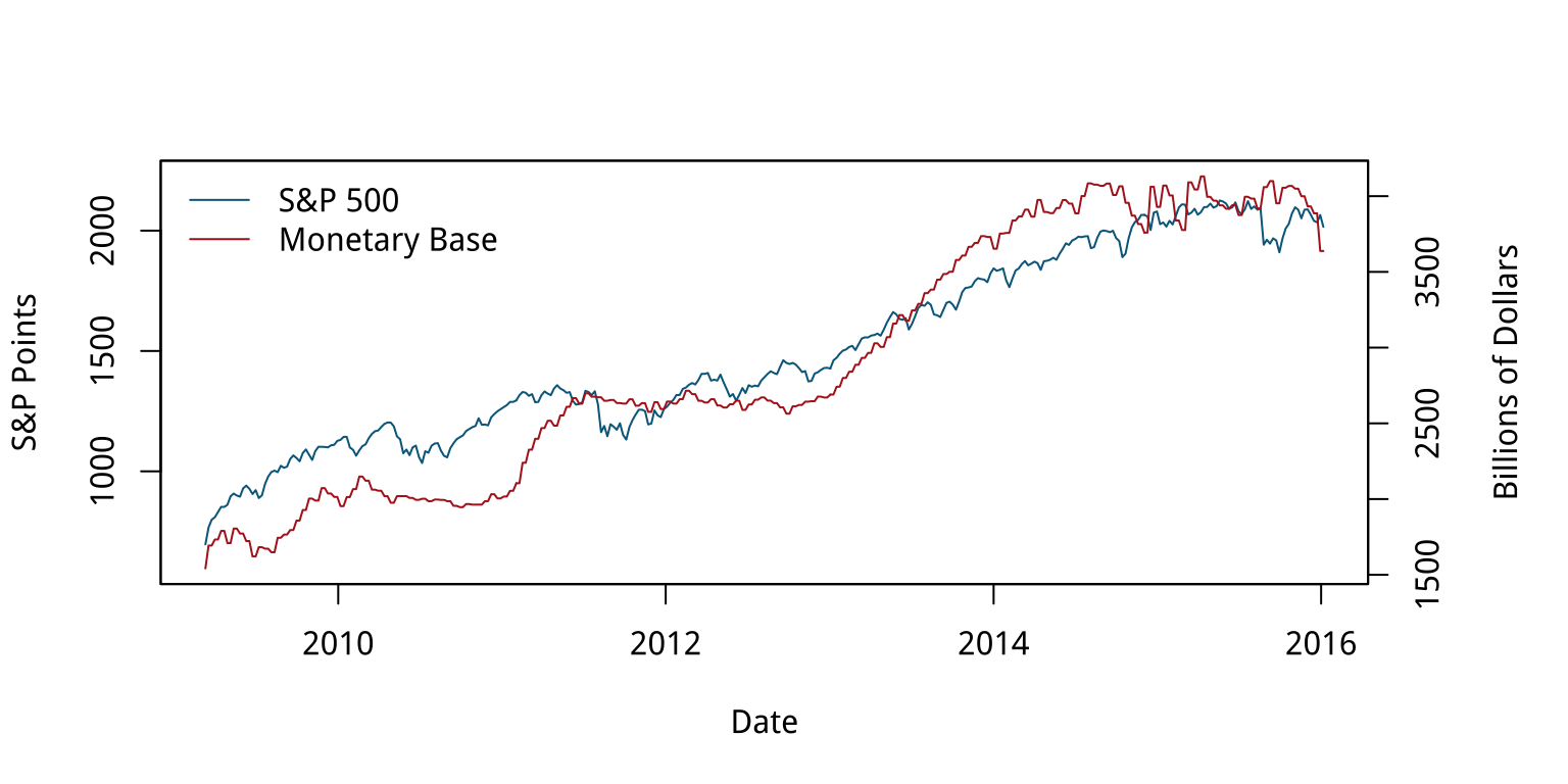
Most of the time when people draw plots with two y-axes they want to line the series up as closely as possible because they suspect that there's a substantive association between them, as in this case. The main problem with using two y-axes is that it makes it even easier than usual to fool yourself (or someone else) about the degree of association between the variables. This is because you can adjust the scaling of the axes to relative to one another in way that moves the data series around more or less however you like. For the first half of the graph in Figure 8.18, the red Monetary Base line tracks below the blue S&P 500 and is above it for the second half.
Figure 8.19: Variations on two y-axes.
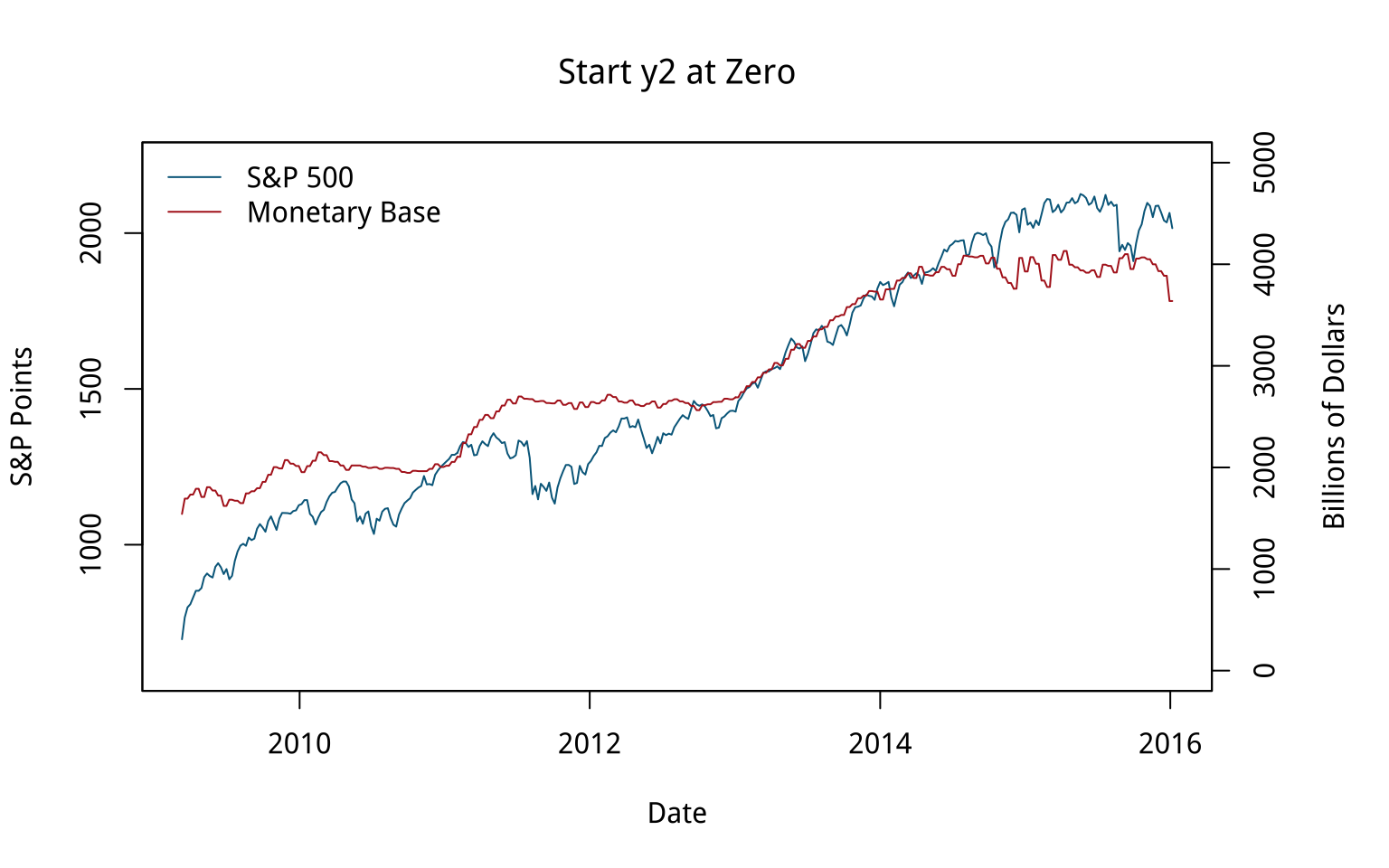
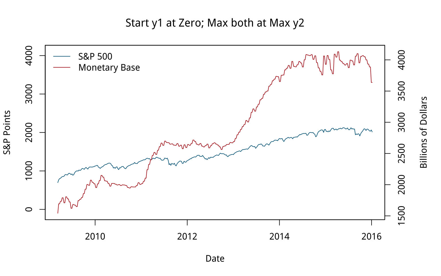
We can "fix" that by deciding to start the second y-axis at zero, which shifts the Monetary Base line above the S&P line for the first half of the series and below it later on. The first panel in Figure 8.19 shows the results. The second panel, meanwhile, adjusts the axes so that the axis tracking the S&P starts at zero. The axis tracking the Monetary Base starts around its minimum (as is generally good practice), but now both axes max out around 4,000. The units are different, of course. The 4,000 on the S&P side is an index number, while the Monetary Base number is 4,000 billion dollars. The effect is to flatten out the S&P's apparent growth quite a bit, muting the association between the two variables substantially. You could tell quite a different story with this one, if you felt like it.
How else might we draw this data? We could use a split- or broken-axis plot to show the two series at the same time. These can be effective sometimes, and they seem to have better perceptual properties than overlayed charts with dual axes (Isenberg, Bezerianos, Dragicevic, & Fekete, 2011). They are most useful in cases where the series you are plotting are of the same kind, but of very different magnitudes. That is not the case here.
Another compromise, if the series are not in the same units (or of widely differing magnitudes), is to rescale one of the series (e.g., by dividing or multiplying it by a thousand), or alternatively to index each of them to 100 at the start of the first period, and then plot them both. Index numbers can have complications of their own, but here they allow us use one axis instead of two, and also to calculate a sensible difference between the two series and plot that as well, in a panel below. It can be quite tricky to visually estimate the difference between series, in part because our perceptual tendency is to look for the nearest comparison point in the other series rather than the one directly above or below. Following Cleveland (1994), we can also add a panel underneath that tracks the running difference between the two series. We begin by making each plot and storing them in an object. To do this, it will be convenient to fully tidy the data in to a long format, with the indexed series in the key variable and their corresponding scores as the values. We use tidyr's gather() function for this:
head(fredts) ## date sp500 monbase sp500_i monbase_i ## 1 2009-03-11 696.68 1542228 100.000 100.000 ## 2 2009-03-18 766.73 1693133 110.055 109.785 ## 3 2009-03-25 799.10 1693133 114.701 109.785 ## 4 2009-04-01 809.06 1733017 116.131 112.371 ## 5 2009-04-08 830.61 1733017 119.224 112.371 ## 6 2009-04-15 852.21 1789878 122.324 116.058 fredts_m <- fredts %>% select(date, sp500_i, monbase_i) %>% gather(key = series, value = score, sp500_i:monbase_i) head(fredts_m) ## date series score ## 1 2009-03-11 sp500_i 100.000 ## 2 2009-03-18 sp500_i 110.055 ## 3 2009-03-25 sp500_i 114.701 ## 4 2009-04-01 sp500_i 116.131 ## 5 2009-04-08 sp500_i 119.224 ## 6 2009-04-15 sp500_i 122.324 Once the data are tidied in this way we can make our graph.
p <- ggplot(data = fredts_m, mapping = aes(x = date, y = score, group = series, color = series)) p1 <- p + geom_line() + theme(legend.position = "top") + labs(x = "Date", y = "Index", color = "Series") p <- ggplot(data = fredts, mapping = aes(x = date, y = sp500_i - monbase_i)) p2 <- p + geom_line() + labs(x = "Date", y = "Difference") Now we have our two plots, we want to lay them out nicely. We do not want them to appear in the same plot area, but we do want to compare them. It would be possible to do this with a facet, but that would mean doing a fair amount of data munging to get all three series (the two indices and the difference between them) into the same tidy data frame. An alternative is to make two separate plots and then arrange them just as we like. For instance, have the comparison of the two series take up most of the space, and put the plot of the index differences along the bottom in a smaller area.
The layout engine used by R and ggplot, called grid, does make this possible. It controls the layout and positioning of plot areas and objects at a lower level than ggplot. Programming grid layouts directly takes a little more work than using ggplot's functions alone. Fortunately, there are some helper libraries that we can use to make things easier. One possibility is to use the gridExtra library. It provides a number of useful functions that let us talk to the grid engine, including grid.arrange(). This function takes a list of plot objects and instructions for how we would like them arranged. The cowplot library we mentioned earlier makes things even easier. It has a plot_grid() function that works much like grid.arrange() while also taking care of some fine details, including the proper alignment of axes across separate plot objects.
cowplot:: plot_grid(p1, p2, nrow = 2, rel_heights = c(0.75, 0.25), align = "v") Figure 8.20: Indexed series with a running difference below, using two separate plots.
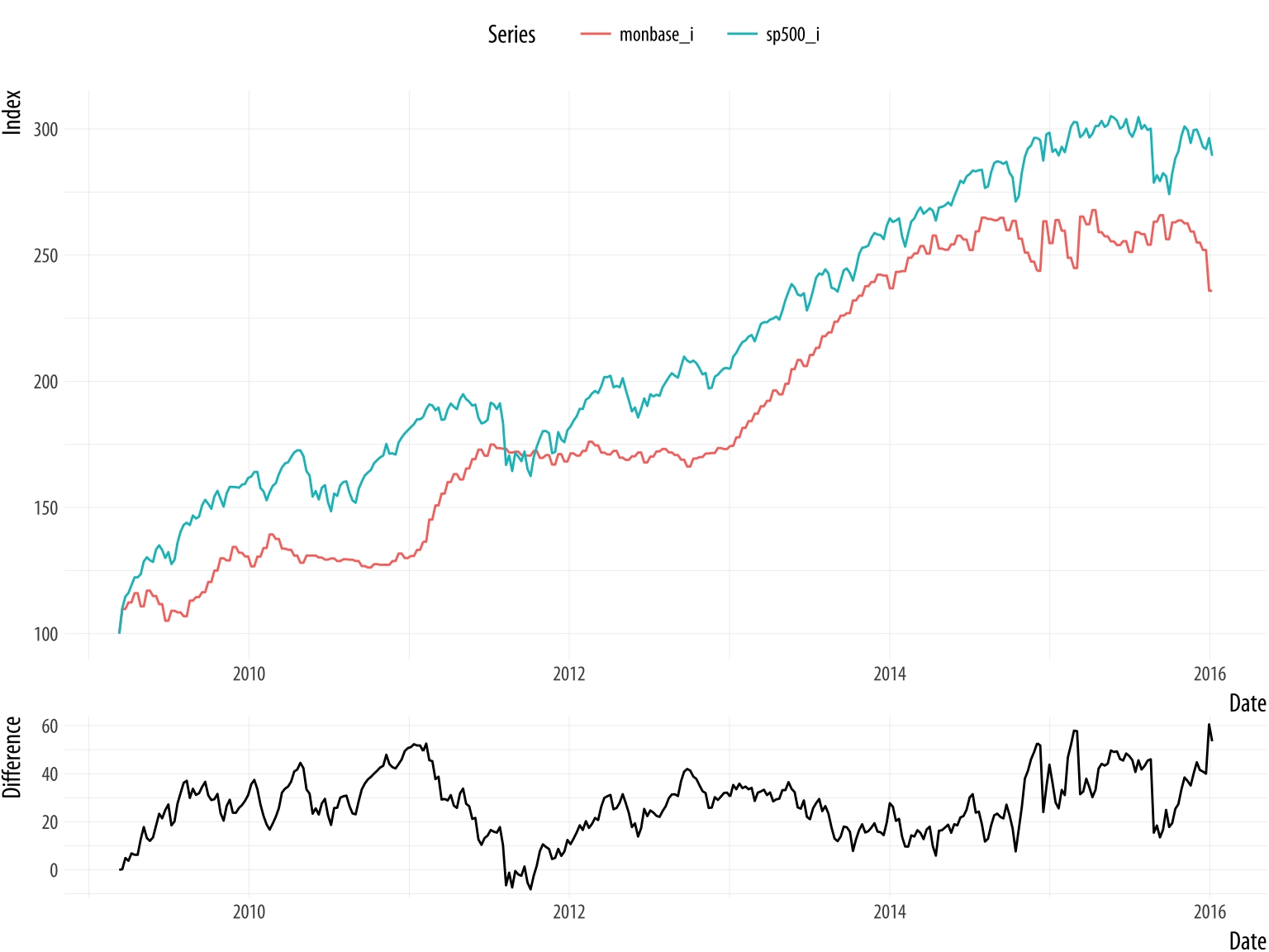
The result is shown in Figure 8.20. It looks pretty good. In this version, the S&P index runs above the Monetary Base for almost the whole series, whereas in the plot as originally drawn, they crossed.
The broader problem with dual-axis plots of this sort is that the apparent association between these variables is probably spurious. The original plot is enabling our desire to spot patterns, but substantively it is probably the case that both of these time series are tending to increase, but are not otherwise related in any deep way. If we were interested in establishing the true association between them, we might begin by naively regressing one on the other. We can try to predict the S&P Index from the Monetary Base, for instance. If we do that, things look absolutely fantastic to begin with, as we appear to explain about 95% of the variance in the S&P just by knowing the size of the Monetary Base from the same period. We're going to be rich!
Sadly, we're probably not going to be rich. While everyone knows that correlation is not causation, with time series data we get this problem twice-over. Even just considering a single series, each observation is often pretty closely correlated with the observation in the period immediately before it, or perhaps with the observation some regular number of periods before it. A time series might have a seasonal component that we would want to account for before making claims about its growth, for example. And if we ask what predicts its growth, then we will introduce some other time series, which will have trend properties of its own. In those circumstances, we more or less automatically violate the assumptions of ordinary regression analysis in a way that produces wildly overconfident estimates of association. The result, which may seem paradoxical when you first run across it, is that a lot of the machinery of time series analysis is about making the serial nature of the data go away.
Like any rule of thumb, it is possible to come up with exceptions, or talk oneself into them. We can imagine situations where the judicious use of dual y-axes might be a sensible way to present data to others, or might help a researcher productively explore a dataset. But in general I recommend against it because is already much too easy to present spurious, or at least overconfident, associations, especially with time series data. Scatterplots can do that just fine. Even with a single series, as we saw back in Chapter 1, we can make associations look steeper or flatter by fiddling with the aspect ratio. Using two y-axes gives you an extra degree of freedom to mess about with the data that, in most cases, you really should not take advantage of. A rule like this will not stop people who want to fool you with charts from trying, of course. But it might help you not fool yourself.
Redrawing a bad slide
In late 2015, Marissa Mayer's performance as CEO of Yahoo was being criticized by many observers. One of them, Eric Jackson, an investment fund manager, sent a 99-slide presentation to Yahoo's board outlining his best case against Mayer. (He also circulated it publicly.) The style of the slides was typical of business presentations. Slides and posters are a very useful means of communication. In my experience, most people who complain about "Death by PowerPoint" have not sat through enough talks where the presenter hasn't even bothered to prepare slides. But it is striking to see how fully the "slide deck" has escaped its origins as an aid to communication and metastasized into a freestanding quasi-format of its own. Business, the Military, and Academia have all been infected by this tendency in various ways. Never mind taking the time to write a memo or an article, just give us endless pages of bullet points and charts. The disorienting effect is of constant summaries of discussions that never took place.
Figure 8.21: A bad slide.
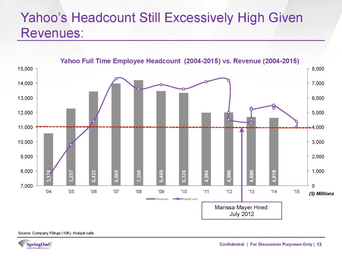
In any case, Figure 8.21 reproduces a typical slide from the deck. It seems to want to say something about the relationship between Yahoo's number of employees and its revenue, in the context of Mayer's tenure as CEO. The natural thing to do would be to make some kind of scatterplot to see if there was a relationship between these variables. Instead, however, the slide puts time on the x-axis and uses two y-axes to show the employee and revenue data. It plots the revenues as a bar chart and the employee data as points connected by slightly wavy lines. At first glance, it is not clear whether the connecting line segments are just manually added or if there's some principle underlying the wiggles. (They turn out to have been created in Excel.) The revenue values are used as labels within the bars. The points are not labeled. Employee data goes to 2015 but revenue data only to 2014. An arrow points to the date Mayer was hired as CEO, and a red dotted line seems to indicate … actually I'm not sure. Maybe some sort of threshold below which employee numbers should fall? Or maybe just the last observed value, to allow comparison across the series? It isn't clear. Finally, notice that while the revenue numbers are annual, there is more than one observation per year for some of the later employee numbers.
How should we redraw this chart? Let's focus on getting across the relationship between employee numbers and revenue, as that seems to be the motivation for it in the first place. As a secondary element, we want to say something about Mayer's role in this relationship. The original sin of the slide is that it plots two series of numbers using two different y-axes, as discussed above. We see this from business analysts more often than not. Time is almost the only thing they ever put on the x-axis.
To redraw the chart I took the numbers from the bars on the chart together with employee data from QZ.com. Where there was quarterly data in the slide, I used the end-of-year number for employees, except for 2012. Mayer was appointed in July of 2012. Ideally we would have quarterly revenue and quarterly employee data for all years, but given that we do not, the most sensible thing to do is to keep things annualized except for the one year of interest, when Mayer arrives as CEO. It's worth doing this because otherwise the large round of layoffs that immediately preceded her arrival would be misattributed to her tenure as CEO. The upshot is that we have two observations for 2012 in the dataset. They have the same revenue data but different employee numbers. The figures can be found in the yahoo dataset.
head(yahoo) ## Year Revenue Employees Mayer ## 1 2004 3574 7600 No ## 2 2005 5257 9800 No ## 3 2006 6425 11400 No ## 4 2007 6969 14300 No ## 5 2008 7208 13600 No ## 6 2009 6460 13900 No The redrawing is straightforward. We could just draw a scatterplot and color the points by whether Mayer was CEO at the time. By now you should know how to do this quite easily. We can take a small step further by making a scatterplot but also holding on to the temporal element beloved of business analysts. We can use geom_path() and use use line segments to "join the dots" of the yearly observations in order, labeling each point with its year. The result is a plot that shows the trajectory of the company over time, like a snail moving across a flagstone. Again, bear in mind that we have two observations for 2012.
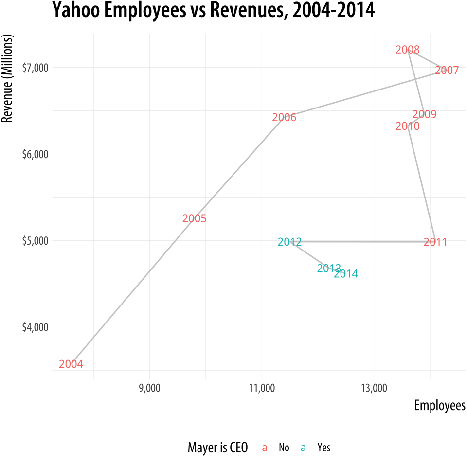 Figure 8.22: Redrawing as a connected scatterplot.
p <- ggplot(data = yahoo, mapping = aes(x = Employees, y = Revenue)) p + geom_path(color = "gray80") + geom_text(aes(color = Mayer, label = Year), size = 3, fontface = "bold") + theme(legend.position = "bottom") + labs(color = "Mayer is CEO", x = "Employees", y = "Revenue (Millions)", title = "Yahoo Employees vs Revenues, 2004-2014") + scale_y_continuous(labels = scales::dollar) + scale_x_continuous(labels = scales::comma) This way of looking at the data suggests that Mayer was appointed after a period of falling revenues and just following a very large round of layoffs, a fairly common pattern with the leadership of large firms. Since then, either through new hires or acquisitions, employee numbers have crept back up a little while revenues have continued to fall. This version conveys what the original slide was trying to get across, but rather more clearly.
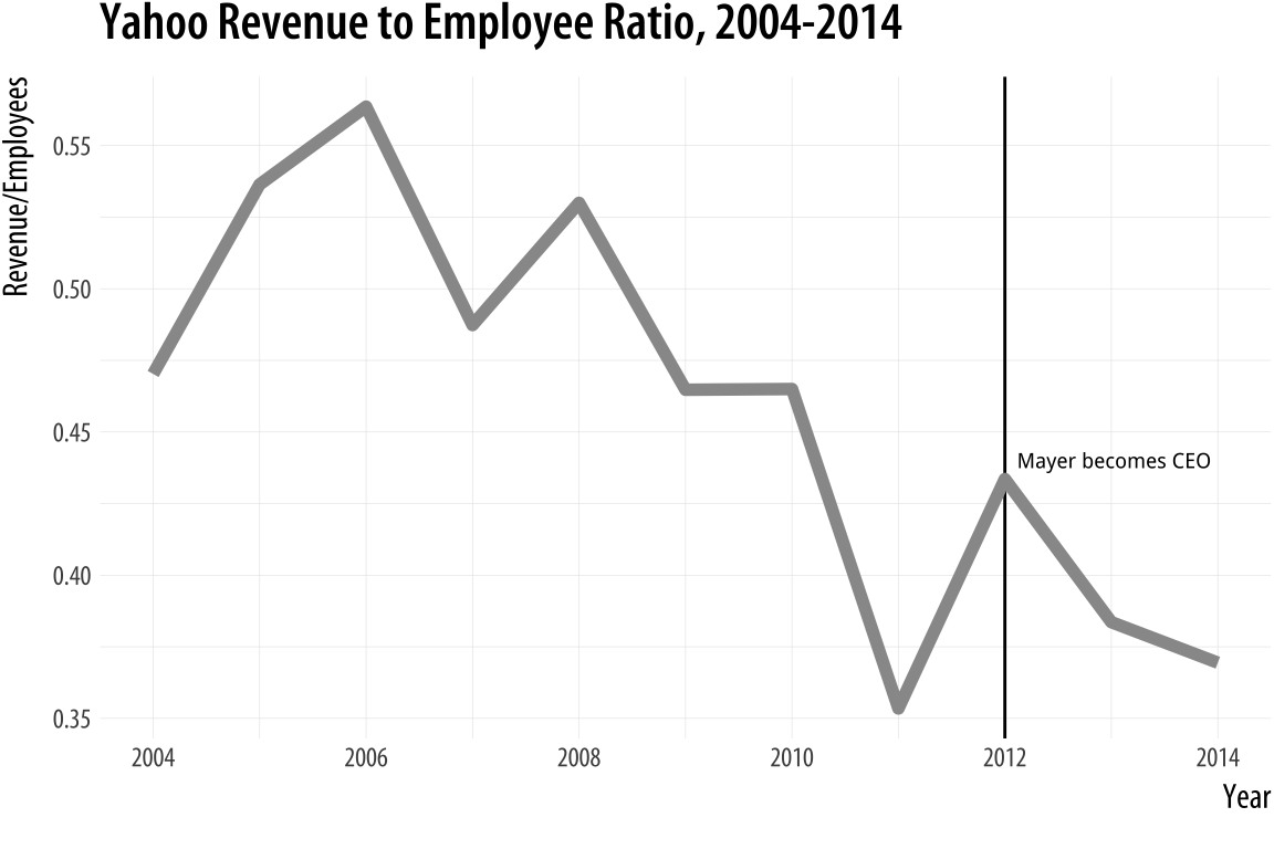
Alternatively, we can keep the analyst community happy by putting time back on the x-axis and plotting the ratio of revenue to employees on the y-axis. This gives us the linear time-trend trend back, only in a more sensible fashion. We begin the plot by using geom_vline() to add a vertical line marking Mayer's accession to the CEO position.
p <- ggplot(data = yahoo, mapping = aes(x = Year, y = Revenue/Employees)) p + geom_vline(xintercept = 2012) + geom_line(color = "gray60", size = 2) + annotate("text", x = 2013, y = 0.44, label = " Mayer becomes CEO", size = 2.5) + labs(x = "Year \n ", y = "Revenue/Employees", title = "Yahoo Revenue to Employee Ratio, 2004-2014") Figure 8.23: Plotting the ratio of revenue to employees against time.
Saying no to pie
For a third example, we turn to pie charts. Figure 8.24 shows a pair of charts from a New York Federal Reserve Bank briefing on the structure of debt in the United States (Chakrabarti, Haughwout, Lee, Scally, & Klaauw, 2017). As we saw in Chapter 1, the perceptual qualities of pie charts are not great. In a single pie chart, it is usually harder than it should be to estimate and compare the values shown, especially when there are more than a few wedges and when there are a number of wedges reasonably close in size. A Cleveland dot plot or a bar chart is usually a much more straightforward way of comparing quantities. When comparing the wedges between two pie charts, as in this case, the task is made harder again as the viewer has to ping back and forth between the wedges of each pie and the vertically oriented legend underneath.
Figure 8.24: Data on the structure of US student debts as of 2016.
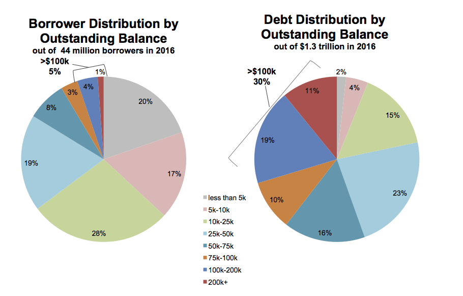
There is an additional wrinkle in this case. The variable broken down in each pie chart is not only categorical, it is also ordered from low to high. The data describe the percent of all borrowers and the percent of all balances divided up across the size of balances owed, from less than five thousand dollars to more than two hundred thousand dollars. It's one thing to use a pie chart to display shares of an unordered categorical variable, such as percent of total sales due to pizza, lasanga, and risotto for example. Keeping track of ordered categories in a pie chart is harder again, especially when we want to make a comparison between two distributions. The wedges of these two pie charts are ordered (clockwise, from the top), but it's not so easy to follow them. This is partly because of the pie-ness of the chart, and partly because the color palette chosen for the categories is not sequential. Instead it is unordered. The colors allow the debt categories to be distinguished, but don't pick out the sequence from low to high values.
So not only is a less than ideal plot type being used here, it's being made to do a lot more work than usual, and with the wrong sort of color palette. As is often the case with pie charts, the compromise made to facilitate interpretation is to display all of the numerical values for every wedge, and also to add a summary outside the pie. If you find yourself having to do this, it's worth asking whether the chart could be redrawn, or whether you might as well just show a table instead.
Here are two ways we might redraw these pie charts. As usual, neither approach is perfect. Or rather, each approach draws attention to features of the data in slightly different ways. Which works best depends on what parts of the data we want to highlight. The data are in an object called studebt:
head(studebt) ## # A tibble: 6 x 4 ## Debt type pct Debtrc ## <ord> <fct> <int> <ord> ## 1 Under $5 Borrowers 20 Under $5 ## 2 $5-$10 Borrowers 17 $5-$10 ## 3 $10-$25 Borrowers 28 $10-$25 ## 4 $25-$50 Borrowers 19 $25-$50 ## 5 $50-$75 Borrowers 8 $50-$75 ## 6 $75-$100 Borrowers 3 $75-$100 Our first effort to redraw the pie charts uses a faceted comparison of the two distributions. We set up some labels in advance, as we will reuse them. We also make a special label for the facets.
p_xlab <- "Amount Owed, in thousands of Dollars" p_title <- "Outstanding Student Loans" p_subtitle <- "44 million borrowers owe a total of $1.3 trillion" p_caption <- "Source: FRB NY" f_labs <- c(` Borrowers ` = "Percent of \n all Borrowers", ` Balances ` = "Percent of \n all Balances") p <- ggplot(data = studebt, mapping = aes(x = Debt, y = pct/ 100, fill = type)) p + geom_bar(stat = "identity") + scale_fill_brewer(type = "qual", palette = "Dark2") + scale_y_continuous(labels = scales::percent) + guides(fill = FALSE) + theme(strip.text.x = element_text(face = "bold")) + labs(y = NULL, x = p_xlab, caption = p_caption, title = p_title, subtitle = p_subtitle) + facet_grid(~ type, labeller = as_labeller(f_labs)) + coord_flip() Figure 8.25: Faceting the pie charts.
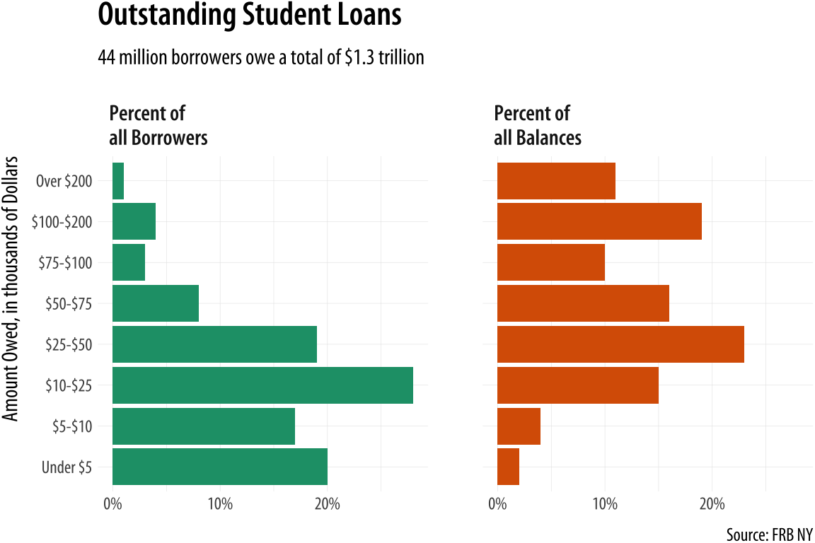
There is a reasonable amount of customization in this graph. First, the text of the facets is made bold in the theme() call. The graphical element is first named (strip.text.x) and then modified using the element_text() function. We also use a custom palette for the fill mapping, via scale_fill_brewer(). And finally we relabel the facets to something more informative than their bare variable names. This is done using the labeller argument and the as_labeller() function inside the facet_grid() call. At the beginning of the plotting code, we set up an object called f_labs, which is in effect a tiny data frame that associates new labels with the values of the type variable in studebt. We use backticks (the angled quote character located next to the '1' key on US keyboards) to pick out the values we want to relabel. The as_labeller() function takes this object and uses it to create new text for the labels when facet_grid() is called.
Substantively, how is this plot better than the pie charts? We split the data into the two categories, and showed the percentage shares as bars. The percent scores are on the x-axis. Instead of using color to distinguish the debt categories, we put their values on the y-axis instead. This means we can compare within a category just by looking down the bars. For instance, the left-hand panel shows that almost a fifth of the 44 million people with student debt owe less than five thousand dollars. Comparisons across categories are now easier as well, as we can scan across a row to see, for instance, that while just one percent or so of borrowers have more than $200,000 in debt, that category accounts for more than 10 percent of all debts.
We could also have made this bar chart by putting the percentages on the y-axis and the categories of amount owed on the x-axis. When the categorical axis labels are long, though, I generally find it's easier to read them on the y-axis. Finally, while it looks nice and helps a little to have the two categories of debt distinguished by color, the colors on the graph are not encoding or mapping any information in the data that is not already taken care of by the faceting. The fill mapping is useful, but also redundant. This graph could easily be in black and white, and would be just as informative if it were.
One thing that is not emphasized in a faceted chart like this is the idea that each of the debt categories is a share or percentage of a total amount. That is what a pie chart emphasizes more than anything, but as we saw there's a perceptual price to pay for that, especially when the categories are ordered. But maybe we can hang on to the emphasis on shares by using a different kind of barplot. Instead of having separate bars distinguished by heights, we can array the percentages for each distribution proportionally within a single bar. We will make a stacked bar chart with just two main bars, and lie them on their side for comparison.
library(viridis) p <- ggplot(studebt, aes(y = pct/ 100, x = type, fill = Debtrc)) p + geom_bar(stat = "identity", color = "gray80") + scale_x_discrete(labels = as_labeller(f_labs)) + scale_y_continuous(labels = scales::percent) + scale_fill_viridis(discrete = TRUE) + guides(fill = guide_legend(reverse = TRUE, title.position = "top", label.position = "bottom", keywidth = 3, nrow = 1)) + labs(x = NULL, y = NULL, fill = "Amount Owed, in thousands of dollars", caption = p_caption, title = p_title, subtitle = p_subtitle) + theme(legend.position = "top", axis.text.y = element_text(face = "bold", hjust = 1, size = 12), axis.ticks.length = unit(0, "cm"), panel.grid.major.y = element_blank()) + coord_flip() 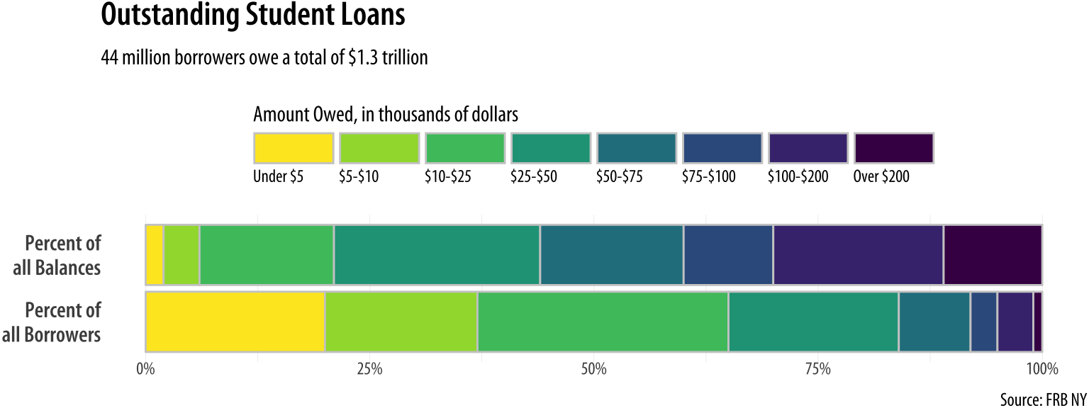
Figure 8.26: Debt distributions as horizontally segmented bars.
Once again, there is a substantial amount of customization in this chart. I encourage you to peel it back one option at a time to see how it changes. We use the as_labeller() with f_labs again, but in the labels for the x-axis this time. We make a series of adjustments in the theme() call to customize the purely visual elements of the plot, making the y-axis labels larger, right-justified, and bold via element_text(); removing the axis tick marks, and also removing the y-axis grid lines via element_blank().
More substantively, we take a lot of care about color in Figure 8.26. First, we set the border colors of the bars to a light gray in geom_bar() to make the bar segments easier to distinguish. Second, we draw on the viridis library again (as we did with our small-multiple maps in Chapter 7), using scale_fill_viridis() for the color palette. Third, we are careful to map the income categories in an ascending sequence of colors, and to adjust the key so that the values run from low to high, from left to right, and from yellow to purple. This is done partly by switching the fill mapping from Debt to Debtrc. The categories of the latter are the same as the former, but the sequence of income levels is coded in the order we want. We also show the legend to the reader first by putting it at the top, under the title and subtitle.
The rest of the work is done in the guides() call. We have not used guides() much thus far except to turn off legends that we did not want to display. But here we see its usefulness. We give guides() a series of instructions about the fill mapping: reverse reverse = TRUE the direction of the color coding; put title.position the legend title above the key; put label.position the labels for the colors below the key; widen keywidth the width of the color boxes a little, and place nrow the whole key on a single row.
This is a lot of work, relatively speaking, but if you don't do it the plot will be much harder to read. Again, I encourage you to peel away the layers and options in sequence to see how the plot changes. The version in Figure 8.26 lets us more easily see how the categories of dollar amounts owed break down as a percentage of all balances, and as a percent of all borrowers. We can also eyeball comparisons between the two types, especially at the far end of each scale. It's easy to see how a tiny percentage of borrowers account for a disproportionately large share of total debt, for example. But even with all of this careful work, estimating the size of each individual segment is still not as easy here as it is in Figure 8.25, the faceted version. This is because it's harder to estimate sizes when we don't have an anchor point or baseline scale to compare each piece to. (In the faceted plot, that comparison point was the x-axis.) So the size of the "Under 5" segment in the bottom bar is much easier to estimate than the size of the "$10-25" bar, for instance. Our injunction to take care about using stacked bar charts still has a lot of force, even when we try hard to make the best of them.
Where to go next
We have reached the end of our introduction. From here on, you should be in a strong position to forge ahead in two main ways. The first is to become more confident and practised with your coding. Learning ggplot should encourage you to learn more about the set of tidyverse tools, and then by extension to learn more about R in general. What you choose to pursue will (and should) be driven by your own needs and interests as a scholar or data scientist. The most natural text to look at next is Garrett Grolemund r4ds.had.co.nz/ and Hadley Wickham's R for Data Science (Wickham & Grolemund, 2016), which introduces tidyverse components that we have drawn on here but not pursued in depth. Other useful texts include Chang (2013) and Roger leanpub.com/rprogramming Peng's R Programming for Data Science (2016). The most thorough introduction to ggplot in particular can be found in Wickham (2016).
Pushing ahead to use ggplot for new kinds of graphs will eventually get you to the point where ggplot does not quite do what you need, or does not quite provide the sort of geom you want. In that case, the first place to look is the world of extensions to the ggplot framework. We have used a few extensions in the book already. Like ggrepel and ggridges, extensions typically provide a new geoms or two to work with, which may be just what you need. Sometimes, as with Thomas Lin Pedersen's ggraph, you get a whole family of geoms and associated tools—in ggraph's case, a suite of tidy methods for the visualization of network data. Other modeling and analysis tasks may require more custom work, or coding that is closely connected to the kind of analysis being done. Harrell (2016) provides many clearly worked examples, mostly based on ggplot; Gelman & Hill (2018) and (Imai, 2017) also introduce contemporary methods using R; (Silge & Robinson, 2017) present a tidy approach to analyzing and visualizing textual data; while Friendly & Meyer (2017) thoroughly explore the analysis of discrete data, an area that is often challenging to approach visually.
The second way you should push ahead is by looking at and thinking about other people's graphs. The R Graph Gallery r-graph-gallery.com , run by Yan Holtz, is a useful collection of examples of many kinds of graphics drawn with ggplot and other R tools. PolicyViz policyviz.com , a site run by Jon Schwabish, covers a range of topics on data visualization. It regularly features case-studies where visualizations are reworked to improve them or cast new light on the data they present. But do not just look for examples that have code with them to begin with. As I have said before, a real strength of ggplot is the grammar of graphic that underpins it. That grammar is a model you can use to look at and interpret any graph, no matter how it was produced. It gives you a vocabulary that lets you say what the data, mappings, geoms, scales, guides, and layers of any particular graph might be. And because the grammar is implemented as the ggplot library, it is a short step from being able to anatomize the structure of a graph to being able to sketch an outline of the code you could write to reproduce it yourself.
While its underlying principles and goals are relatively stable, the techniques and tools of research are changing. This is especially true within the social sciences (Salganik, 2018). Data visualization is an excellent entry-point to these new developments. Our tools for it are more versatile and powerful than ever. So, you should look at your data. Looking is not a replacement for thinking. It cannot force you to be honest; it cannot magically prevent you from making mistakes; and it cannot make your ideas true. But if you analyze data, visualization can help you uncover features in it. If you are honest, it can help you live up to your own standards. When you inevitably make errors, it can help you find and correct them. And if you have an idea and some good evidence for it, it can help you show it in a compelling way.
Source: https://socviz.co/refineplots.html
0 Response to "And Use Your Judgment to Make the Plots Look Continuous"
Postar um comentário